How one nonprofit gala used custom illuminated décor across every touchpoint to create a cohesive, memorable evening.
The best-designed events have something in common: they tell a consistent story from the moment guests arrive to the moment they leave. The décor, the branding, the atmosphere — it all speaks the same visual language, and every detail reinforces the same identity. Nothing feels accidental. Everything feels considered.
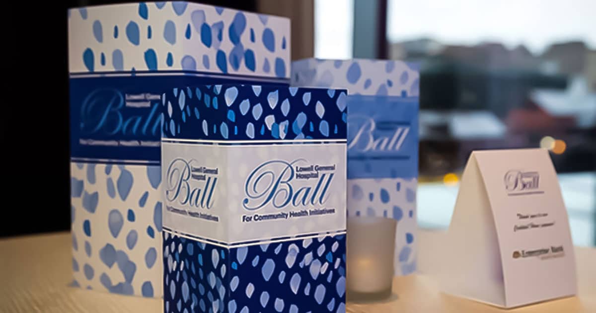
The Lowell General Hospital Ball for Community Health Initiatives is a perfect example of what that looks like in practice — and these photographs tell the story beautifully.
One Brand. Every Surface. Every Room.
What makes this event so striking is how completely the Hospital Ball branding carries through every element of the space. The elegant script logo, the deep navy and soft blue palette, the delicate leaf-and-dot pattern — these aren’t just applied to one piece or one area of the room. They appear on the table centerpieces, the silent auction display, the cocktail hour column, the sponsor recognition piece, and everything in between. Walk into any corner of this event and you know immediately where you are and whose evening this is.
That kind of cohesion doesn’t happen by accident. It happens when a client brings a strong brand identity and applies it consistently across every custom piece — and when the décor is designed to carry that identity with elegance rather than overwhelm it.
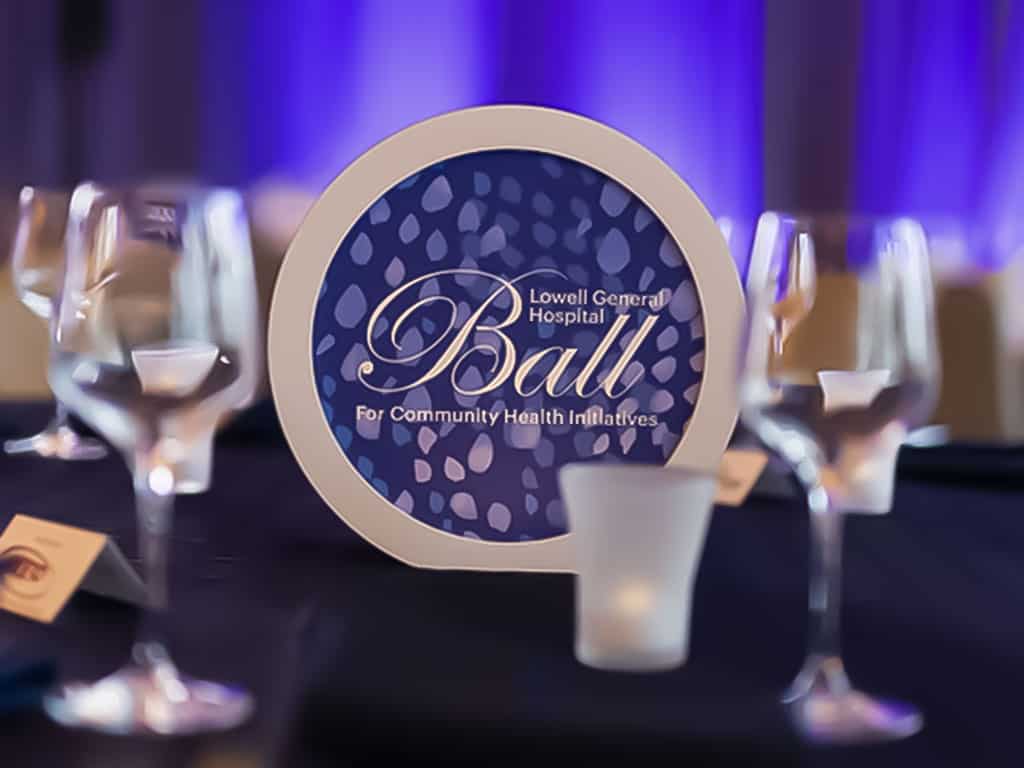
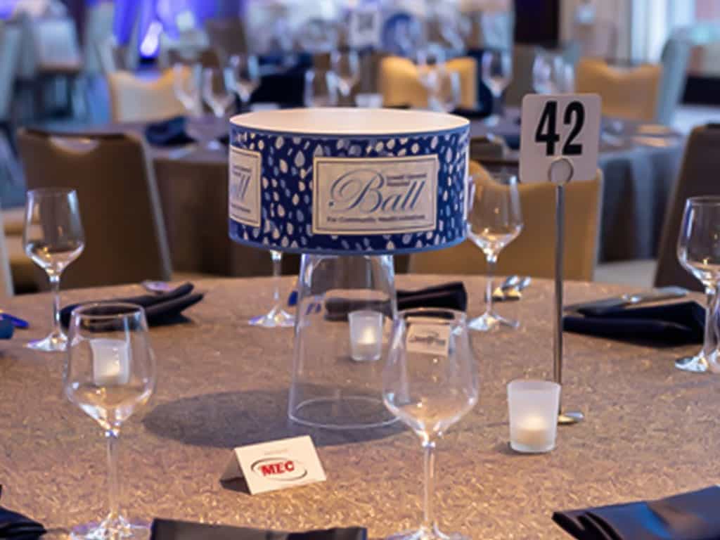
The Halo Centerpiece — A New Kind of Table Display
At the heart of each dining table sits one of Illuminaria’s Halo Centerpieces — and in these photographs, you can see exactly why this product is so special. The large circular face glows with the Ball’s logo and signature pattern, warm and luminous against the deep navy background. The white foam core frame creates a clean, gallery-like border that focuses the eye directly on the graphic.
Elevated on a clear acrylic base, the Halo sits at just the right height — present and impactful without blocking sightlines across the table. It’s a centerpiece that guests notice immediately and remember long after the evening ends.
Square Closed Top Centerpieces — Bold Branding on the Cocktail Tables
In the cocktail area, a trio of square closed top centerpieces carries the same branding in a different format. The bold, repeating pattern wraps all four sides of each piece, and the graduating sizes create a layered, sculptural display that draws the eye even from across the room. Together they create a striking branded vignette that makes the cocktail table feel like a destination rather than simply a surface.
This is the graduating trio format at its best — three sizes, one graphic identity, extraordinary visual impact.
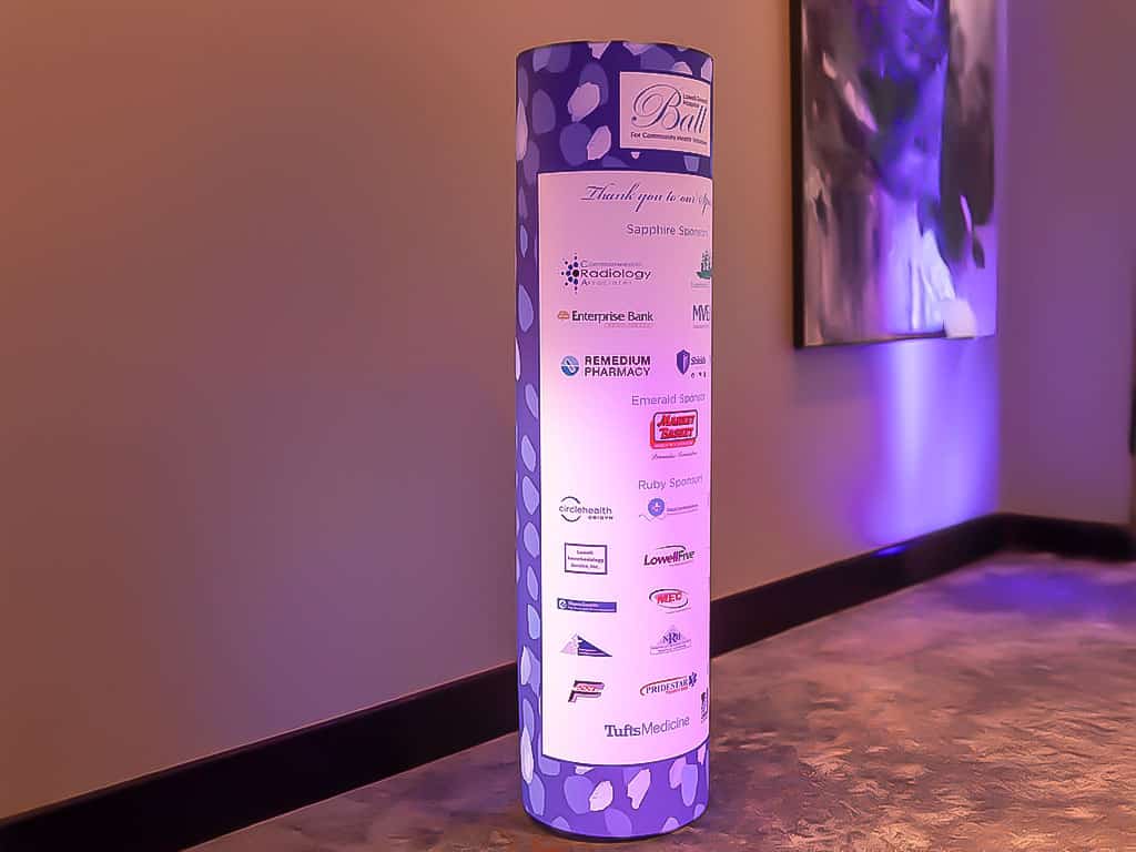
The Sponsor Column — Recognition That Glows
In the foyer, a full-height round column carries the event’s sponsor recognition — and it does so with far more elegance than a printed banner or a flat signage board ever could. Sapphire sponsors, Emerald sponsors, Ruby sponsors — each tier presented clearly and beautifully on a glowing, backlit surface that commands attention in the pre-event space.
The column’s design is a lesson in effective sponsor recognition. The Ball branding anchors the top, the sponsor tiers are clearly delineated, and the logos are given room to breathe against the glowing background. Every sponsor gets visibility that feels intentional and prestigious rather than squeezed onto a page. And because the column glows, it draws guests in naturally — people want to find their sponsor, their organization, their name in the light.
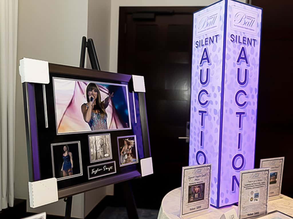
The Silent Auction Column — Function Meets Beauty
Perhaps the most creative use of Illuminaria’s column format in this event is the silent auction display — a square column branded with the Ball’s signature pattern and the words SILENT AUCTION in bold, elegant type, glowing in a soft purple light that perfectly complements the event’s color palette.
Placed at the entrance to the auction area alongside a framed display, the column does double duty: it marks the space clearly so guests can find it easily, and it elevates the auction presentation from a table of items to a curated, designed experience. It signals to guests that what’s inside this space is worth their attention — and their bids.
What This Event Gets Right
Looking at these photographs as a whole, a few things stand out as lessons for any nonprofit event planner:
Consistency compounds.
One branded centerpiece is nice. A room full of consistently branded pieces — centerpieces, columns, auction displays, cocktail tables, all carrying the same visual identity — creates an atmosphere that feels truly designed. The whole is far greater than the sum of its parts.
Light elevates everything.
Every piece in this event glows. That warm, even illumination from within is what transforms a printed graphic into something that feels alive and special. Under event lighting, a glowing centerpiece reads completely differently from a printed one — and guests respond to it differently too.
Bold design reads across a room.
The Ball’s graphic identity — that elegant script logo, that deep navy, that distinctive pattern — works beautifully in this format because it was designed with confidence. Strong colors, clear hierarchy, a distinctive pattern that reads at scale. Every piece in the room is instantly recognizable from a distance.
Planning a Gala or Fundraising Ball?
The Lowell General Hospital Ball shows what’s possible when custom illuminated décor is used thoughtfully and consistently across an entire event. From the table centerpieces to the sponsor column to the silent auction display, every piece works together to create an evening that feels genuinely special — and raises the kind of money that meaningful community health work deserves.
Illuminaria would love to help you create something just as beautiful for your next gala.